Have you ever looked at your prescription bottle and seen a little yellow sticker with a picture of a car or a glass of wine and wondered what it really means? You’re not alone. Millions of people in the U.S. get medication labels with these icons every year, but most don’t know how to read them properly. These aren’t just decorations-they’re safety tools designed to keep you from getting hurt. And yet, pharmacy warning icons are often misunderstood, ignored, or missed entirely.
What Are Pharmacy Warning Icons and Why Do They Exist?
Pharmacy warning icons are small, standardized symbols printed or stuck onto prescription bottles to alert patients about important risks. They’re meant to be quick, visual cues that work even if you can’t read well, don’t speak English, or are just in a hurry. The goal? To prevent mistakes that lead to hospital visits, accidents, or worse. These icons didn’t just appear out of nowhere. They came from years of research and real-world errors. The Institute for Safe Medication Practices (ISMP) started pushing for standardization in the 1990s after noticing that patients kept misreading handwritten instructions. By the mid-2000s, major pharmacy chains like CVS and Walgreens began adopting them. Today, about 90% of U.S. prescriptions include at least one warning icon. The FDA estimates that medication errors contribute to at least 7,000 deaths each year in the U.S. Many of those errors happen because patients don’t understand what the label says. Icons help bridge that gap. A picture of a sleeping person means “this drug makes you drowsy.” A red circle with a slash over a drinking glass means “no alcohol.” Simple. Visual. Immediate.Common Warning Icons and What They Actually Mean
Not all icons are the same, but most pharmacies use similar ones. Here are the most common ones you’ll see-and what they really mean:- Yellow car icon - “May cause drowsiness. Do not drive or operate machinery.” This is one of the most misunderstood. People think it just means “be careful.” It means: don’t get behind the wheel. The ISMP recorded 29 car accidents between 2019 and 2022 from patients ignoring this.
- Red glass with a slash - “Avoid alcohol.” Alcohol can make sedatives, painkillers, and antibiotics dangerously strong. In some cases, mixing them can cause liver damage or sudden breathing problems.
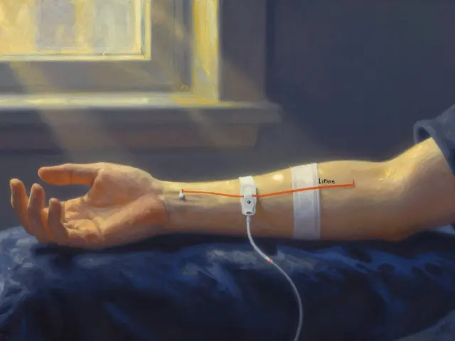
- Stomach with a clock - “Take on empty stomach.” This doesn’t mean “skip breakfast.” It means wait at least one hour before eating or two hours after. Food can block absorption, making the drug useless.
- Hand with a dropper - “For external use only.” This one’s dangerous. A Reddit user shared that their mother took eye drops orally because she thought the dropper meant she should swallow them. That’s not rare. Studies show 68% of patients with low health literacy misinterpret this symbol.
- Food plate - “Take with food.” This isn’t a suggestion. Some drugs irritate the stomach lining. Taking them without food can cause ulcers or bleeding. Others need fat to be absorbed properly.
- Cracked pill with a slash - “Do not crush or chew.” Many people crush pills to make them easier to swallow. But extended-release pills can release their full dose all at once-leading to overdose. One study found 57% of patients thought “do not crush” meant “don’t swallow whole.”
Why Color Matters-And Why It Doesn’t Always Work
You’ve probably noticed that warning labels come in different colors. Yellow is the most common. Red is rare. Blue and green are used too. Most patients assume red means “danger,” yellow means “caution,” and white or blue means “just a reminder.” That’s what the FDA found in a 2019 survey: 42% of people interpret color as severity level. But here’s the problem-there’s no national standard for colors in the U.S. Some pharmacies use yellow for sedatives. Others use it for blood thinners. One chain might use tan for antibiotics. Another uses it for antifungals. In 127 reported incidents between 2015 and 2020, pharmacists confused the color codes themselves. That’s not a patient error-that’s a system failure. New Zealand and the UK have national systems. In the UK, there are only 9 warning labels. After standardizing, misinterpretation dropped from 39% to 17%. In the U.S., CVS uses 14 icons. Walgreens uses 17. Independent pharmacies? On average, 23 different ones. That’s chaos.Why Patients Still Get It Wrong-Even When the Icons Are Clear
You’d think if the icons are simple, people would understand them. But research shows otherwise. Consumer Reports found that 52% of Americans misinterpret at least one common warning. The FDA’s own patient survey revealed:- 63% say there are too many labels-so they ignore them all.
- 58% say the text is too small to read without glasses.
- 49% say the symbols don’t make sense.
What Pharmacies Are Doing to Fix This
The system is broken, but change is coming. In September 2022, the FDA released draft guidelines to standardize 12 core warning icons nationwide by 2026. CVS and Walgreens have already committed to cutting their lists down to match. That’s a big deal. It means a patient walking into any pharmacy in Texas or Maine will see the same symbols. Some pharmacies are also adding QR codes to labels that link to short video explanations. Kaiser Permanente tested this in 2022 and saw comprehension jump from 58% to 89%. But here’s the catch: 24% of seniors don’t use smartphones regularly. So the video solution helps some-but leaves others behind. Pharmacists are also being trained better. Most states now require 2 hours of medication safety training per year. Clinical systems now suggest only the top 1-3 warnings per prescription instead of dumping 5 or 6 on every bottle. Less clutter. More focus. Still, only 41% of pharmacy warning labels include any reference to the evidence behind them. That means patients don’t know why the warning exists. They just see a symbol and shrug.What You Can Do to Stay Safe
You can’t wait for the system to fix itself. Here’s how to protect yourself:- Ask for a verbal explanation. Don’t just take the bottle and go. Say: “Can you explain what this icon means?” Pharmacists are trained to do this. They expect it.
- Take a picture of the label. If you’re confused, snap a photo and show it to a family member, your doctor, or even a trusted online community like r/pharmacy.
- Don’t assume. If you’re not 100% sure what “take on empty stomach” means, look it up or call your pharmacy. Don’t guess.
- Use a pill organizer with reminders. Many come with visual cues that match common warning icons. Helps you remember timing and precautions.
- Report confusion. If a label made you unsure, tell the pharmacy. The more feedback they get, the better they’ll improve.
The Bottom Line
Pharmacy warning icons are meant to save lives. But they only work if you understand them. Right now, the system is inconsistent, cluttered, and sometimes misleading. National standardization is on the way, but it’s not here yet. Your best defense? Don’t rely on symbols alone. Always ask. Always double-check. And if you’re ever unsure-call your pharmacist. They’re not just filling prescriptions. They’re your last line of defense against a mistake that could change everything.Are pharmacy warning icons the same everywhere in the U.S.?
No. There is no national standard yet. CVS uses 14 warning icons, Walgreens uses 17, and independent pharmacies often use 20 or more. This inconsistency can confuse patients who switch pharmacies or travel between states. The FDA is pushing for a national standard of 12 core icons by 2026, but until then, symbols may vary.
What does a yellow sticker on my pill bottle mean?
Yellow is the most common color for cautionary labels in the U.S., but it doesn’t mean one specific thing. It could indicate drowsiness, interactions with alcohol, or a need to take the medication with food. The symbol and text matter more than the color. Always read the words underneath.
Can I ignore a warning icon if I’ve taken the medicine before without problems?
No. Warnings are based on the drug’s properties, not your personal experience. For example, a sedative might make you sleepy now, but if you start taking it with a new medication or if you get older, the effect could be stronger. Never assume past safety means future safety.
Why do some labels have both a symbol and a long paragraph?
The symbol gives you a quick visual cue. The paragraph is required by the FDA for high-risk drugs and provides detailed safety info, like possible side effects or interactions. The symbol is for immediate understanding; the text is for full context. Always read both.
What should I do if I think my pharmacy put the wrong warning on my medicine?
Call the pharmacy immediately. Ask them to verify the warning against the prescription and drug information sheet. If they confirm it’s wrong, they’re legally required to correct it. If they dismiss your concern, ask to speak with the pharmacist on duty or contact your doctor. Never take a medication if you’re unsure about its safety instructions.


Comments
David Brooks
7 December 2025Finally someone gets it! I used to ignore those stickers till my uncle ended up in the ER after mixing his blood thinner with wine. Now I show my grandma every icon on her bottles. She calls me her little pharmacist. 🙌
Kurt Russell
7 December 2025Look, I’m not a doctor but I’ve worked in pharmacies for 18 years. The real problem isn’t the icons-it’s that pharmacists are rushed. You get 90 seconds to explain 6 meds, 4 icons, and a new insurance plan. No wonder people zone out. We need more time, not more stickers.
Kyle Flores
9 December 2025my mom cant read good and she always asks me about the little pics on her pills. i used to think it was just her but then i realized half my friends dont know what the car symbol means either. maybe we should have like a 30-sec video on the bottle qr code? like, just a guy saying ‘this makes you sleepy, dont drive’ in plain english.
Louis Llaine
9 December 2025Wow. A whole article about stick-on pictures. Next you’ll tell us not to lick the battery. At least the icons are better than the 1990s handwritten scribbles that said ‘take 1 qd’-which means ‘take one every day’ unless you’re a pharmacist who thinks ‘qd’ is ‘quadruple dose.’
Sam Mathew Cheriyan
9 December 2025you know what they dont tell you? the icons are a distraction. big pharma and the fda want you focused on the stupid car and glass so you dont ask why your pill costs $400. the real danger is the price, not the alcohol. they put the icons there to make you feel safe while they rob you blind. just saying.
Jennifer Anderson
11 December 2025i used to roll my eyes at these icons too… until my sister took her antidepressant with grapefruit juice and ended up in the hospital. now i print out a cheat sheet for my parents and tape it to the fridge. if you’re confused, ask. seriously. we’re all learning.
Oliver Damon
13 December 2025From a systems theory perspective, the heterogeneity of iconography across pharmacy chains represents a failure of institutional isomorphism. The lack of standardized semiotic encoding leads to cognitive dissonance in low-health-literacy populations, thereby increasing the probability of adverse drug events. Standardization, while administratively complex, is a necessary condition for reducing error entropy in pharmaceutical communication.
Jane Quitain
14 December 2025i love how the article says ‘ask your pharmacist’ like they have 3 hours to chat. i got my meds last week and the pharmacist was on the phone with insurance for 10 minutes. then she handed me the bottle like ‘here ya go, good luck!’ 😅
Ernie Blevins
14 December 2025everyone’s acting like these icons are some miracle. newsflash: people still die from meds. the icons are just a legal shield for pharmacies. if you die because you didn’t know not to drink, it’s your fault. they don’t care. they just want to cover their butts.
Ted Rosenwasser
15 December 2025Let’s be honest - if you can’t interpret a pictogram of a glass with a slash, you probably shouldn’t be managing your own medications. Maybe a guardian? Or a pill dispenser with voice prompts? Or just… stop taking pills? 🤔
Ryan Sullivan
15 December 2025It’s not about the icons. It’s about the erosion of pharmaceutical literacy. The commodification of healthcare has reduced patient education to a compliance checklist. These symbols are not solutions-they are symptoms of a system that treats patients as liabilities rather than partners. The FDA’s 12-icon standard is a cosmetic bandage on a hemorrhaging wound.
Olivia Hand
16 December 2025Why is the hand-with-dropper icon still used? It’s misleading. Why not a syringe with a red X over a mouth? Or at least a label that says ‘topical’? Symbols evolve. This one hasn’t. And it’s killing people. We need better design, not more training.
Desmond Khoo
18 December 2025my dad took his blood pressure med with grapefruit juice for 3 years because he thought ‘no alcohol’ meant no beer, not no fruit. now he’s on a new med and i made him a little cheat sheet with emojis: 🚗 = don’t drive, 🍷 = no wine, 🍊 = no grapefruit. he laughs but he remembers now. 😊
Kyle Oksten
18 December 2025There’s a deeper truth here: we’ve outsourced responsibility for our own health. We hand over a prescription and assume the system will protect us. But safety isn’t designed into symbols-it’s built into habits. Ask. Verify. Repeat. That’s the real warning icon.
Nancy Carlsen
20 December 2025as a nurse and a daughter of immigrants, i’ve seen this too many times. grandma thinks the ‘take with food’ icon means ‘eat a whole meal with it’ so she takes it with fried chicken and soda. i made a little card with pictures of food she eats every day. now she points to the picture and says ‘yes, rice, not pizza.’ small wins. 🌾❤️